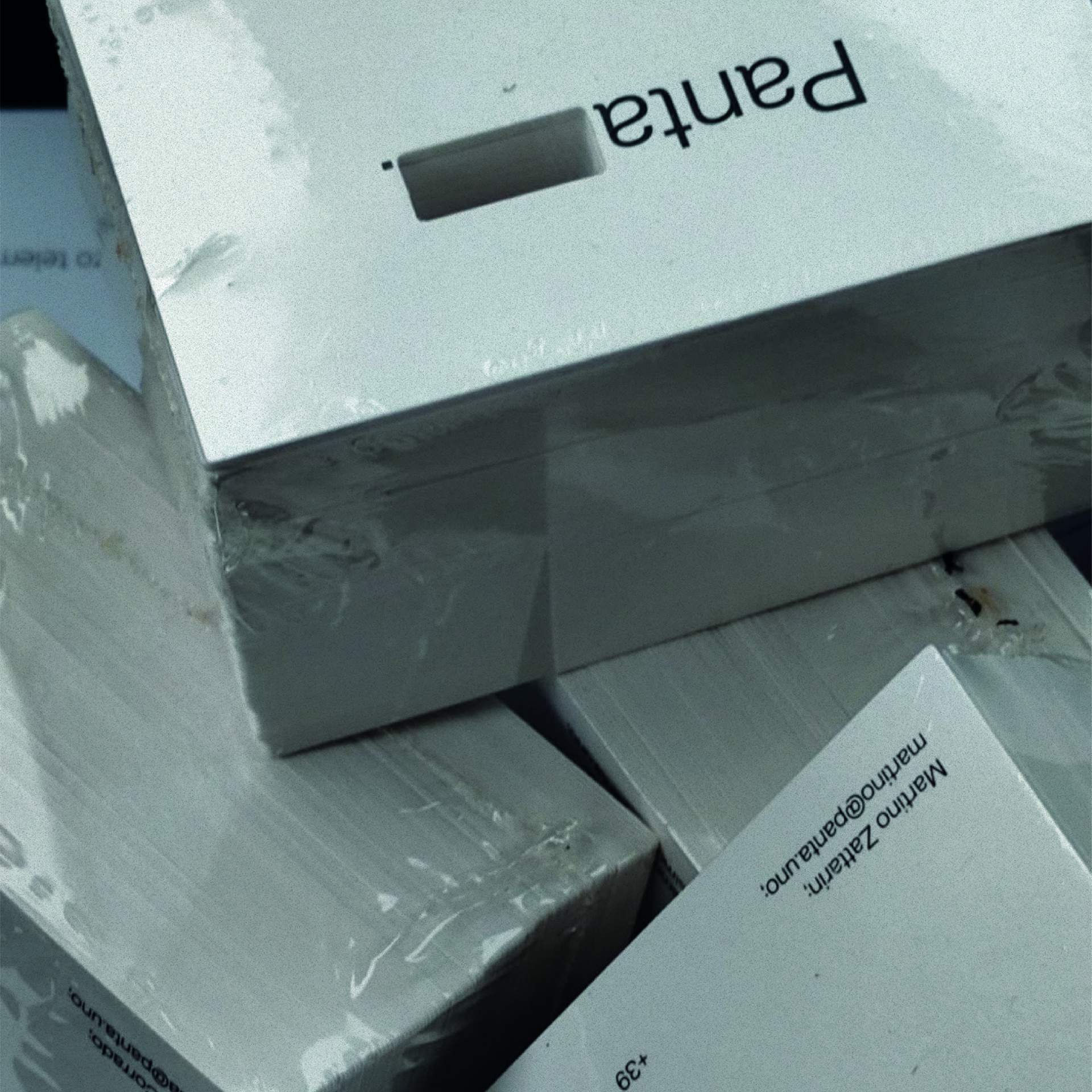
Panta, a young film agency, has recently completed a profound overhaul of its brand. Stemming from its original denomination, Pantalone SRL, the company embarked on a rebranding process aimed at aligning its corporate image with its current market positioning.
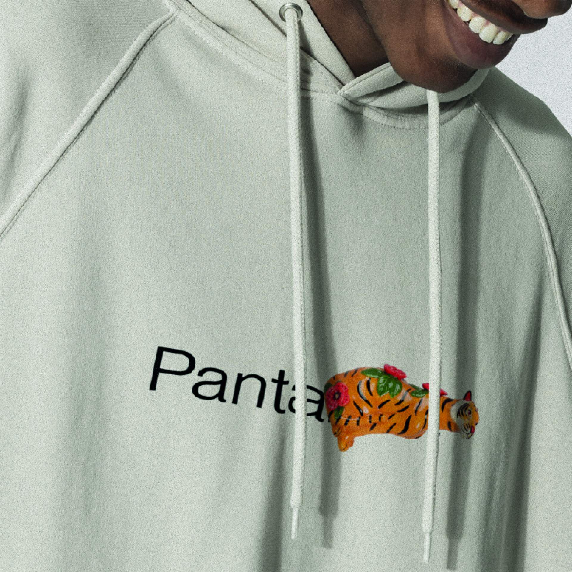
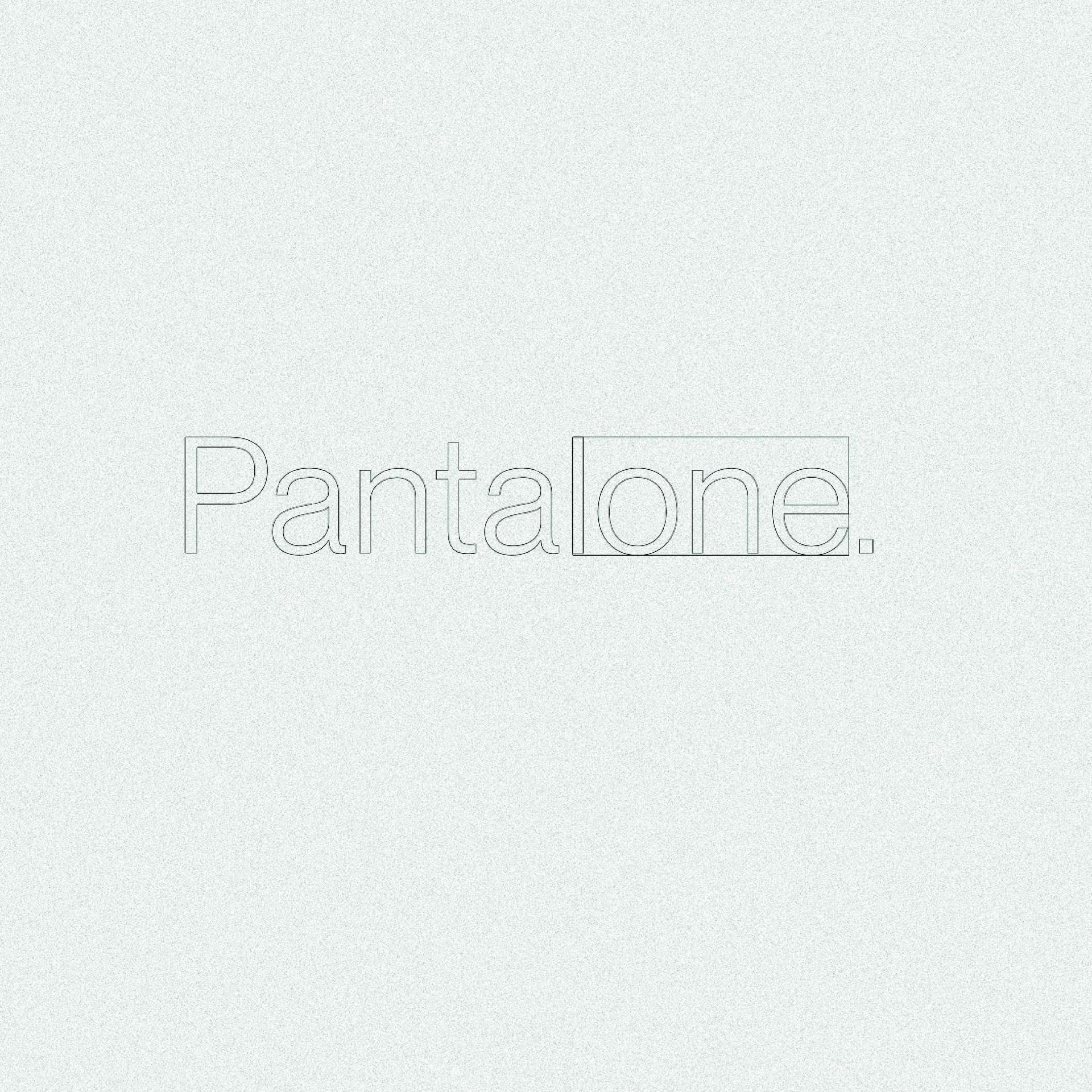
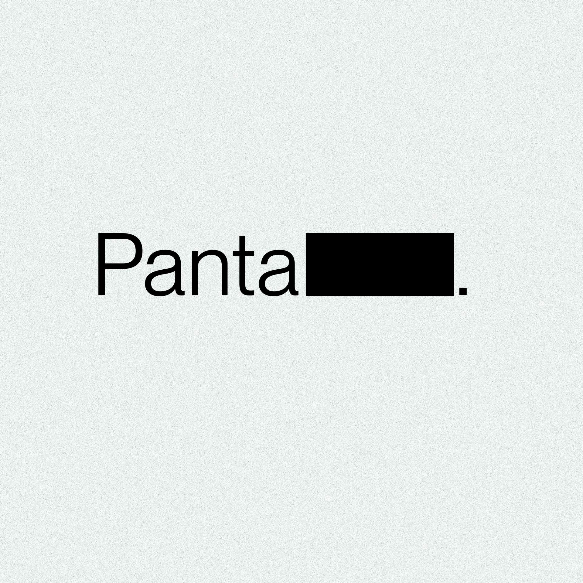
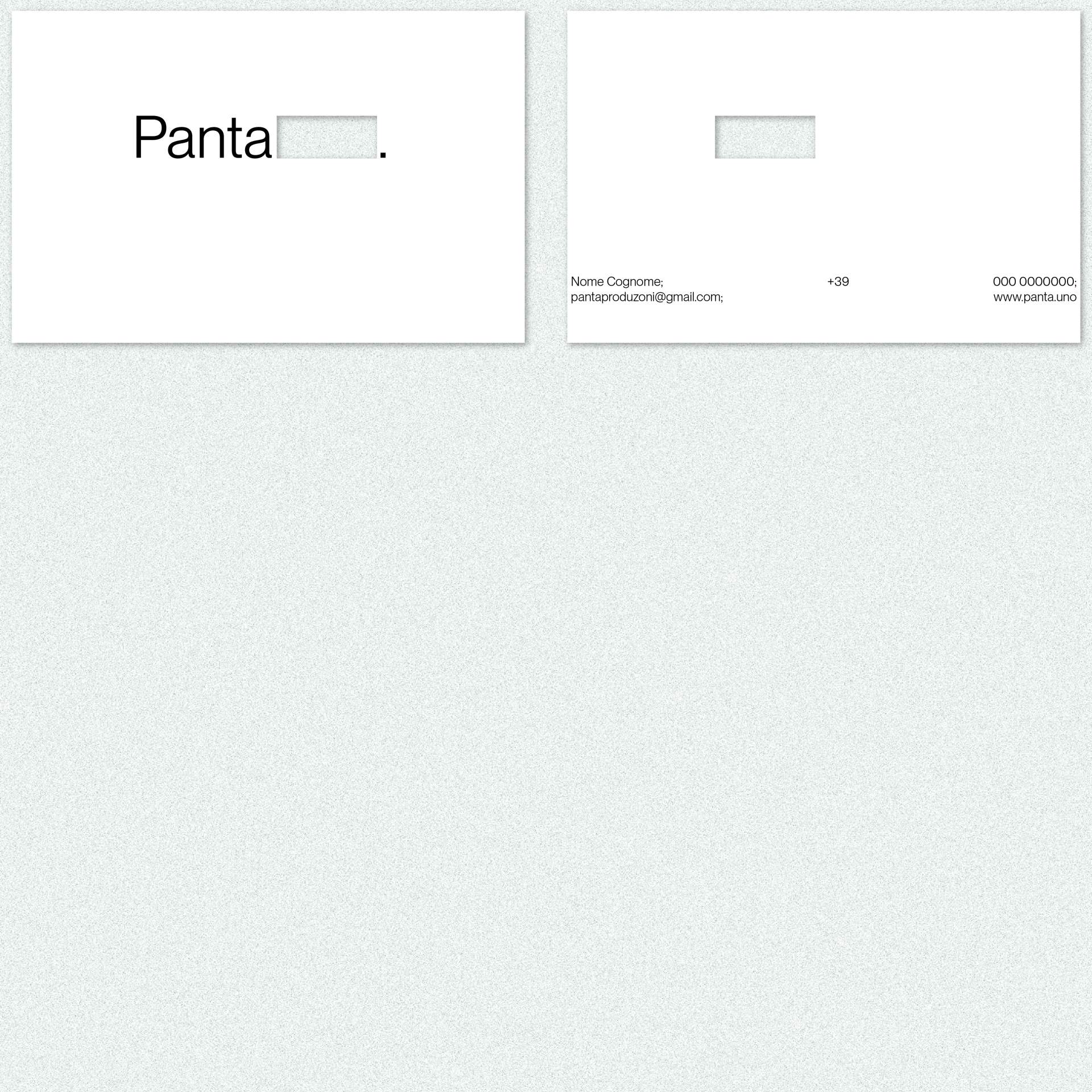
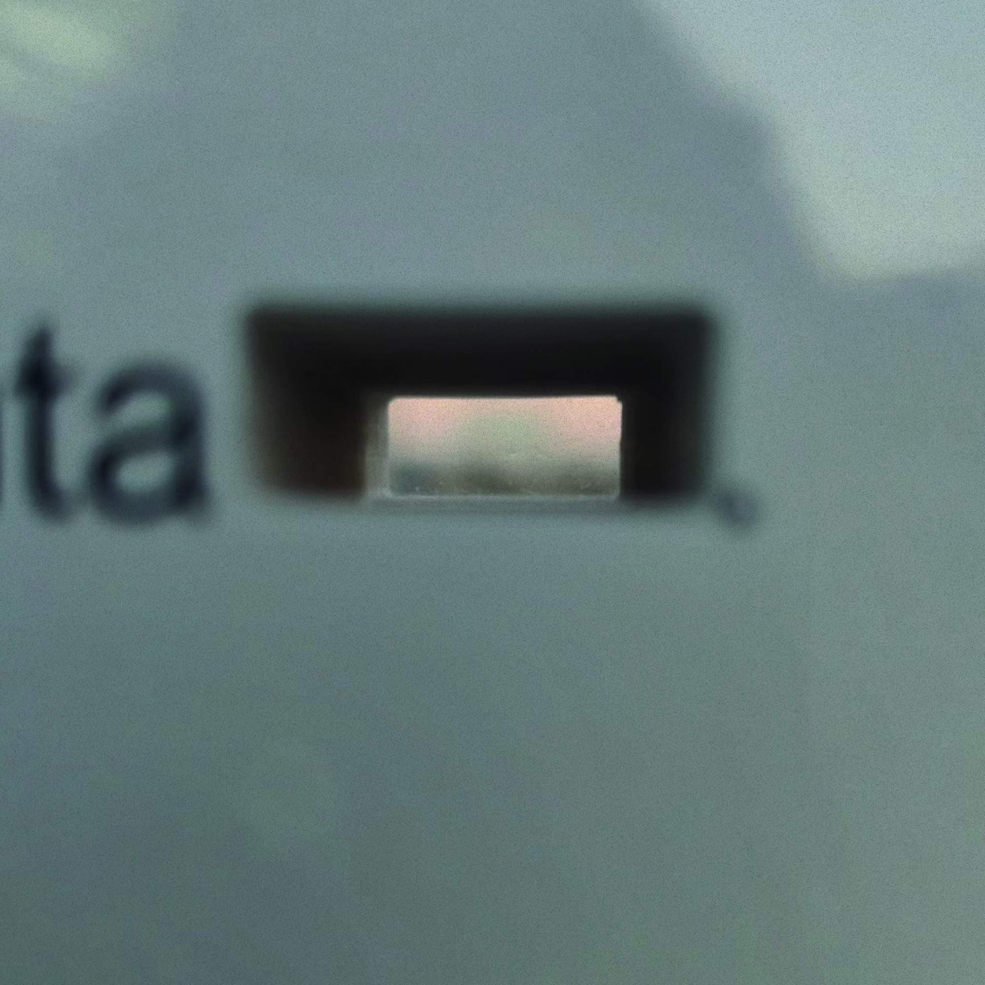
At the heart of this transformation lies the new logo. Born out of a careful analysis of the term "Pantalone" and its etymological roots linked to the famous Italian carnival mask, the logo, partially concealed by a rectangle, incorporates the concept of "masking", suggesting an idea of transformation and reinterpretation. The design also nods to the iconography of the silver screen, albeit in black tones, evoking that still unexplored creative territory.
Panta's rebranding stands out for its rational and meticulously considered approach, aimed at effectively communicating the company's identity and core values. The logo, akin to a mask in constant evolution, adapts seamlessly to diverse situations and contexts, thus ensuring a cohesive and distinctive visual presence for the company, both within its operational sphere and beyond.
Live site:
Panta.uno
Team:
Gioele Bertin/ graphic designer
Francesca Melina/ copy writer
Panta
Branding
2023
Torino
For more information contact us at info@hypergradient.it